
- Posts: 390
Simplified mixer's icons
- domcars0
-
- Offline
Less
More
07 Jan 2013 11:07 - 07 Jan 2013 11:11 #4791
by domcars0
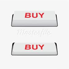
See this samples ..
Designer plays with the light ... not with the colors
Devo 10 (+7e) owner. It's mine, please don't touch it with your big fingers
Replied by domcars0 on topic Simplified mixer
Shape is not changed, but when a button is pushed the light change on it ...FDR wrote: Well, a real physical button, doesn't change it's shape either...
See this samples ..
Designer plays with the light ... not with the colors
Devo 10 (+7e) owner. It's mine, please don't touch it with your big fingers
Last edit: 07 Jan 2013 11:11 by domcars0.
- FDR
-
Topic Author
- Offline
07 Jan 2013 11:20 #4792
by FDR
Replied by FDR on topic Simplified mixer
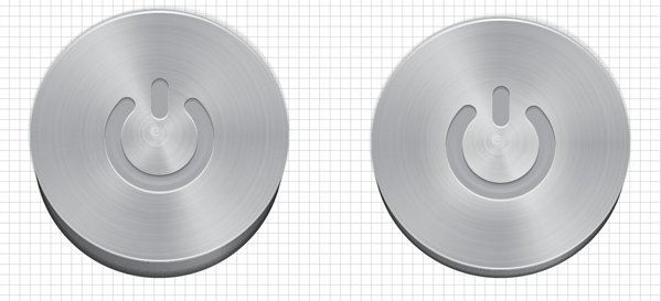
Actually no.
The lighting in these cases are the same, he only simulated that the button is pressed in (into a hole), but the shape stayed the same also.
In your previous examples in the pressed state the light has changed it's direction to coming from the bottom, or the button changed it's shape from domed to hollow...
- FDR
-
- Offline
07 Jan 2013 11:26 - 07 Jan 2013 12:31 #4793
by FDR
Replied by FDR on topic Simplified mixer
With animals, and trims...
Last edit: 07 Jan 2013 12:31 by FDR.
- rbe2012
-
- Offline
- So much to do, so little time...
Less
More
- Posts: 1433
07 Jan 2013 12:40 - 07 Jan 2013 12:40 #4795
by rbe2012
In many cases the light is assumed coming from the left upper corner (maybe in cultures with other writing directions this is different?).
So: if a button is released it looks like his upper and left edge are lighted and the others dark and reversed when it is pressed:
edit: maybe the edges are too small...
Replied by rbe2012 on topic Simplified mixer
As stated above my graphical abilities are poor...domcars0 wrote: the light change on it ...
In many cases the light is assumed coming from the left upper corner (maybe in cultures with other writing directions this is different?).
So: if a button is released it looks like his upper and left edge are lighted and the others dark and reversed when it is pressed:
edit: maybe the edges are too small...
Last edit: 07 Jan 2013 12:40 by rbe2012.
- domcars0
-
- Offline
Less
More
- Posts: 390
07 Jan 2013 13:03 #4796
by domcars0
Devo 10 (+7e) owner. It's mine, please don't touch it with your big fingers
Replied by domcars0 on topic Simplified mixer
OK, rbe2012 is right.. just change the borders light is enough...but please do not invert colors 
Devo 10 (+7e) owner. It's mine, please don't touch it with your big fingers
- FDR
-
- Offline
07 Jan 2013 13:10 - 07 Jan 2013 14:07 #4798
by FDR
Replied by FDR on topic Simplified mixer
Sorry, but I won't redraw all the existing buttons as well. They do this from the very beginning.
You couldn't notice that small border change on the tx, which doesn't have any other feedback, when the button is pressed...
You couldn't notice that small border change on the tx, which doesn't have any other feedback, when the button is pressed...
Last edit: 07 Jan 2013 14:07 by FDR.
- RugWarrior
-
- Offline
Less
More
- Posts: 59
07 Jan 2013 13:32 #4799
by RugWarrior
Replied by RugWarrior on topic Simplified mixer
I think the FDR way is more visible in the field ")
- PhracturedBlue
-
- Offline
Less
More
- Posts: 4403
07 Jan 2013 14:33 #4800
by PhracturedBlue
Replied by PhracturedBlue on topic Simplified mixer
Sorry for jumping in late. FDR, you're doing a great job here.
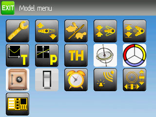
A couple points:
a) The only reason the other buttons use inversion for press is that I was lazy and am a terrible artist. I would be happy to accept patches against that.
b) if you want to reorder the buttons to have similar functions together, that is fine. there is a list in pages/320x240x16/simple/modelmenu.c
c) while I thought the tortoise/hare was a cute metaphor, you don't have to use it if you think of a better answer.
d) I understand what you are trying to do with the 'switches' icon, but I think it is too busy. I didn't realize it was a pic of the tx initially.
e) In my opinion, the telemetry ion looks too much like it has something to do with tx power (my original was even worse). I'm not sure what else to do there; maybe a pic of a tx and a heli with an arrow from the heli to the tx? Not a lot of room for that. Still, what you've got is a lot better than what I started with.
f) I'm concerned with the throttle-hold icon. I don't like having any text on the icons, as it doesn't translate well, but I think it is sometimes necessary when we can't find an alternative. However, when the only thing on the icon is text, it is guaranteed to be meaningless in at least some languages.
And of course, please take all of the above as constructive criticism, and nothing more than suggestions. The new icons look a lot better, and I really appreciate you working on them.
- rbe2012
-
- Offline
- So much to do, so little time...
Less
More
- Posts: 1433
07 Jan 2013 14:42 #4801
by rbe2012
Replied by rbe2012 on topic Simplified mixer
d) this was my thought too. The lines are to thin to see.
f) a stop sign?
f) a stop sign?
- FDR
-
- Offline
07 Jan 2013 14:59 - 07 Jan 2013 15:21 #4802
by FDR
Replied by FDR on topic Simplified mixer
Thanks for the suggestions!
a) PB, please make the menu icons to show their pressed state, because it doesn't work ATM.
b) Since I've dropped the color codes for the function types it is not that important now, but still I think some reordering would be good. I will see, when I'm done with the icons...
c) Yep, it's funny, but differs a bit, just like the clock...
d) This is my first try, I will try to enhance it later...
e) This one is hard. I made the waves to go left and down from the upper right point to mean they are coming back...
f) Throttle hold was a quick one before I went to sleep.")
I want to surround it with a stop sign, but I was lazy to draw that one so far...
EDIT: ...like this:
a) PB, please make the menu icons to show their pressed state, because it doesn't work ATM.
b) Since I've dropped the color codes for the function types it is not that important now, but still I think some reordering would be good. I will see, when I'm done with the icons...
c) Yep, it's funny, but differs a bit, just like the clock...
d) This is my first try, I will try to enhance it later...
e) This one is hard. I made the waves to go left and down from the upper right point to mean they are coming back...
f) Throttle hold was a quick one before I went to sleep.
I want to surround it with a stop sign, but I was lazy to draw that one so far...
EDIT: ...like this:
Last edit: 07 Jan 2013 15:21 by FDR.
- rbe2012
-
- Offline
- So much to do, so little time...
Less
More
- Posts: 1433
07 Jan 2013 15:35 - 07 Jan 2013 15:35 #4803
by rbe2012
Replied by rbe2012 on topic Simplified mixer
good idea, but again a very thin line. How about
 ?
?
Last edit: 07 Jan 2013 15:35 by rbe2012. Reason: (Typo)
- proteus
-
- Offline
Less
More
- Posts: 41
07 Jan 2013 15:53 - 07 Jan 2013 15:56 #4805
by proteus
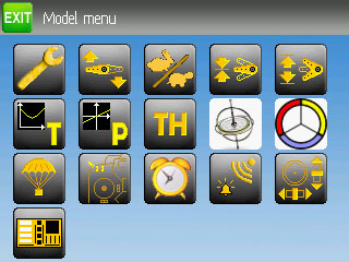
I love this version, just waking I personally replace it with a stopwatch. what is the icon of the parachute?
there is only the icon of the gyroscope to the same design as the other
the yellow color is too light for letters T and P
Replied by proteus on topic Simplified mixer
FDR wrote: Thanks for the suggestions!
a) PB, please make the menu icons to show their pressed state, because it doesn't work ATM.
b) Since I've dropped the color codes for the function types it is not that important now, but still I think some reordering would be good. I will see, when I'm done with the icons...
c) Yep, it's funny, but differs a bit, just like the clock...
d) This is my first try, I will try to enhance it later...
e) This one is hard. I made the waves to go left and down from the upper right point to mean they are coming back...
f) Throttle hold was a quick one before I went to sleep.
I want to surround it with a stop sign, but I was lazy to draw that one so far...
EDIT: ...like this:
I love this version, just waking I personally replace it with a stopwatch. what is the icon of the parachute?
there is only the icon of the gyroscope to the same design as the other
the yellow color is too light for letters T and P
Last edit: 07 Jan 2013 15:56 by proteus.
- PhracturedBlue
-
- Offline
Less
More
- Posts: 4403
07 Jan 2013 16:01 #4806
by PhracturedBlue
Replied by PhracturedBlue on topic Simplified mixer
I did so. What you get for 'free' is the new build system with an included libopencm3. I've been testing it and it seems to work ok, but it is a bug hcange to the build system, and may not work well on all platforms.FDR wrote: Thanks for the suggestions!
a) PB, please make the menu icons to show their pressed state, because it doesn't work ATM.
- FDR
-
- Offline
07 Jan 2013 16:07 #4807
by FDR
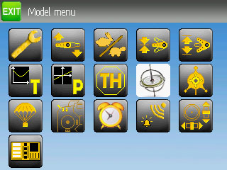
I don't really like the too big filled ones.
That was my concern about the clock too...
Is it better this way:
Replied by FDR on topic Simplified mixer
rbe2012 wrote: good idea, but again a very thin line. How about
?
I don't really like the too big filled ones.
That was my concern about the clock too...
Is it better this way:
- FDR
-
- Offline
07 Jan 2013 16:13 #4808
by FDR
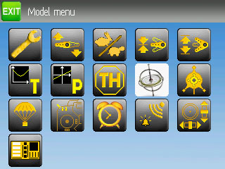
(My stopwatch was too small, this clock is too big... )
The advantage of the clock, that it imply the alarm functionality...
I'll correct them.
Replied by FDR on topic Simplified mixer
I've tried a stopwatch too, couldn't decide which is better.proteus wrote: I love this version, just waking I personally replace it with a stopwatch.
(My stopwatch was too small, this clock is too big...
The advantage of the clock, that it imply the alarm functionality...
Fail-safe.proteus wrote: what is the icon of the parachute?
This will be hard...proteus wrote: there is only the icon of the gyroscope to the same design as the other
Yep, I couldn't correct it, because I don't have the same font at work...proteus wrote: the yellow color is too light for letters T and P
I'll correct them.
- rbe2012
-
- Offline
- So much to do, so little time...
Less
More
- Posts: 1433
07 Jan 2013 17:13 - 07 Jan 2013 17:15 #4812
by rbe2012
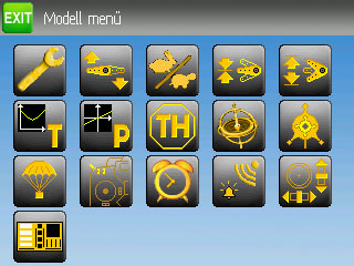
Ha! I can help here.
I reversed the gyro symbol, colored it new, selected the dark background (with the gimp wizard stick) and put a progression on it. You will probably design it again with your colors to make it fit to the rest...

Replied by rbe2012 on topic Simplified mixer
FDR wrote: This will be hard...
Ha! I can help here.
I reversed the gyro symbol, colored it new, selected the dark background (with the gimp wizard stick) and put a progression on it. You will probably design it again with your colors to make it fit to the rest...
Last edit: 07 Jan 2013 17:15 by rbe2012.
- rbe2012
-
- Offline
- So much to do, so little time...
Less
More
- Posts: 1433
07 Jan 2013 19:00 - 07 Jan 2013 19:06 #4813
by rbe2012
Replied by rbe2012 on topic Simplified mixer
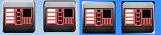
I tried the last proposal (with my gyro) to make as toggle icons to have a look on the real screen. If anyone wants to: here it is. Simply put this in the "media" directory.
Edit: can't append the file, worked earlier. I will try this again later, for so long here is the bitmap: ((Here it should be, but does not work either! Maybe a problem with the bmp format (A1 R5 G5 B5), zipped works))
Edit: can't append the file, worked earlier. I will try this again later, for so long here is the bitmap: ((Here it should be, but does not work either! Maybe a problem with the bmp format (A1 R5 G5 B5), zipped works))
Last edit: 07 Jan 2013 19:06 by rbe2012. Reason: Upload works finally
- FDR
-
- Offline
07 Jan 2013 19:54 #4816
by FDR
I don't really like this gyro either.
I thought about something more schematic thing, like that spinning something in the Inception movie, but I'm lazy, so no it stays for a while...
Replied by FDR on topic Simplified mixer
rbe2012 wrote:
FDR wrote: This will be hard...
Ha! I can help here.
I reversed the gyro symbol, colored it new, selected the dark background (with the gimp wizard stick) and put a progression on it. You will probably design it again with your colors to make it fit to the rest...
I don't really like this gyro either.
I thought about something more schematic thing, like that spinning something in the Inception movie, but I'm lazy, so no it stays for a while...
- proteus
-
- Offline
Less
More
- Posts: 41
07 Jan 2013 20:22 #4817
by proteus
Replied by proteus on topic Simplified mixer
Yessss
it's perfect for me. i like it
it's perfect for me. i like it
- FDR
-
- Offline
07 Jan 2013 20:43 #4819
by FDR
Replied by FDR on topic Simplified mixer
PB, should I push it now, or I have to refine it further first?
Time to create page: 0.478 seconds
-
Home

-
Forum
-
General
-
General Discussions
- Simplified mixer's icons