
- Posts: 521
Simplified mixer's icons
- RandMental
-
- Offline
Less
More
07 Jan 2013 20:48 #4820
by RandMental
Replied by RandMental on topic Simplified mixer
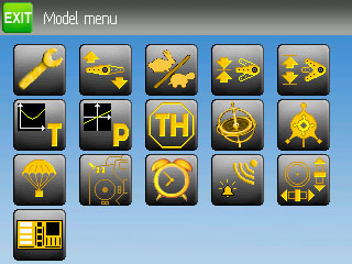
Great work, I have only one suggestion. The spanner is a bit oversized compared to the other graphics, can you shrink it a few pixels
- FDR
-
Topic Author
- Offline
07 Jan 2013 21:34 #4824
by FDR
Replied by FDR on topic Simplified mixer
OK, I made it one pixel shorter on each end.
Is it better?
Is it better?
- domcars0
-
- Offline
Less
More
- Posts: 390
08 Jan 2013 07:21 - 08 Jan 2013 07:23 #4833
by domcars0
Devo 10 (+7e) owner. It's mine, please don't touch it with your big fingers
Replied by domcars0 on topic Simplified mixer
Good job FDR ... thanks. Unfortunatly I can't see the result on a real devo8 screen 
Devo 10 (+7e) owner. It's mine, please don't touch it with your big fingers
Last edit: 08 Jan 2013 07:23 by domcars0.
- RandMental
-
- Offline
Less
More
- Posts: 521
08 Jan 2013 10:24 - 08 Jan 2013 10:25 #4839
by RandMental
Replied by RandMental on topic Simplified mixer
Hi FDR
I don't try to be sinical about you answer, which I have to take that you don't agree. That is fine.
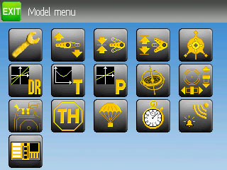
However I have done my share of UI designs, thus my comment. If you take the yellow/grey balance/ratio of the typical icon on the screen, Safe mode(Parachute) is a good example, the spanner is over-sized with much smaller border areas than the others. I would shrink it at least 10%.
Randmental
I don't try to be sinical about you answer, which I have to take that you don't agree. That is fine.
However I have done my share of UI designs, thus my comment. If you take the yellow/grey balance/ratio of the typical icon on the screen, Safe mode(Parachute) is a good example, the spanner is over-sized with much smaller border areas than the others. I would shrink it at least 10%.
Randmental
Last edit: 08 Jan 2013 10:25 by RandMental. Reason: Spelling
- FDR
-
- Offline
08 Jan 2013 17:42 - 08 Jan 2013 19:26 #4846
by FDR
Replied by FDR on topic Simplified mixer
Sorry, if my answer seemed cynical, it wasn't meant to be.
I really shrinked it one-one pixel, and it indeed made a difference, you can compare it if you put them beside each other. After all the whole picture is only 48x47, so two pixels make a difference.
Now I see you want it to be even smaller, but then the other ones (like the clock, swash, etc) would be too big...
Last edit: 08 Jan 2013 19:26 by FDR.
- FDR
-
- Offline
09 Jan 2013 08:51 #4850
by FDR
I've pushed it to my repo and sent a pull request to PB...
I've reordered the menu icons too...
...or do you mean, that you don't have a DEVO8?
Replied by FDR on topic Simplified mixer
domcars0 wrote: Good job FDR ... thanks. Unfortunatly I can't see the result on a real devo8 screen
I've pushed it to my repo and sent a pull request to PB...
I've reordered the menu icons too...
...or do you mean, that you don't have a DEVO8?
- domcars0
-
- Offline
Less
More
- Posts: 390
09 Jan 2013 20:33 - 09 Jan 2013 20:33 #4869
by domcars0
Devo 10 (+7e) owner. It's mine, please don't touch it with your big fingers
Replied by domcars0 on topic Simplified mixer
I don't have a DEVO8 but a DEVO10
Devo 10 (+7e) owner. It's mine, please don't touch it with your big fingers
Last edit: 09 Jan 2013 20:33 by domcars0.
- FDR
-
- Offline
16 Jan 2013 21:01 #5074
by FDR
Replied by FDR on topic Simplified mixer
I converted them for my BW skin.
Which one do you like more?
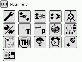
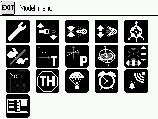
Which one do you like more?
- RandMental
-
- Offline
Less
More
- Posts: 521
16 Jan 2013 21:17 #5076
by RandMental
Replied by RandMental on topic Simplified mixer
Black on white would me my choice.
- domcars0
-
- Offline
Less
More
- Posts: 390
16 Jan 2013 21:24 - 16 Jan 2013 21:28 #5078
by domcars0
Devo 10 (+7e) owner. It's mine, please don't touch it with your big fingers
Replied by domcars0 on topic Simplified mixer
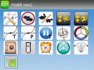
I don't like very much the clock , I would prefer a timer like this for example :

And also, may be you can "zoom" on the switches radio (switches are to small ,radio is to big) ...
Sorry for my frenglish
And also, may be you can "zoom" on the switches radio (switches are to small ,radio is to big) ...
Sorry for my frenglish
Devo 10 (+7e) owner. It's mine, please don't touch it with your big fingers
Last edit: 16 Jan 2013 21:28 by domcars0.
- clearprop88
-
- Offline
Less
More
- Posts: 94
17 Jan 2013 00:42 #5087
by clearprop88
Replied by clearprop88 on topic Simplified mixer
I vote for the Black on White also.
- FDR
-
- Offline
17 Jan 2013 05:27 #5091
by FDR

I'm a bit confused...
I would call the first as black on grey, and the second as white on black, so which one is the black on white?
Sorry for my english, but would you specify is it the fist one or the second?
Replied by FDR on topic Simplified mixer
I'm a bit confused...
I would call the first as black on grey, and the second as white on black, so which one is the black on white?
Sorry for my english, but would you specify is it the fist one or the second?
- rbe2012
-
- Offline
- So much to do, so little time...
Less
More
- Posts: 1433
17 Jan 2013 06:00 #5095
by rbe2012
Replied by rbe2012 on topic Simplified mixer
For me the second look better. But some of the lines (shadow servo arms, tx) seem to be too thin.
Can you add the files so we can try them on the real screen?
Can you add the files so we can try them on the real screen?
- FDR
-
- Offline
17 Jan 2013 09:20 #5102
by FDR
I don't really like the clock either. I wanted to draw a stopwatch too, but was too lazy to do that so far. (This clock was on PB's original...)
One argument on the current clock, that it can alarm, unlike a stopwatch...
OK, later I will try to draw a closer part of the tx with the switches, I'm just worried, that it won't be recognizable...
Replied by FDR on topic Simplified mixer
domcars0 wrote: I don't like very much the clock , I would prefer a timer like this for example :
And also, may be you can "zoom" on the switches radio (switches are to small ,radio is to big) ...
Sorry for my frenglish
I don't really like the clock either. I wanted to draw a stopwatch too, but was too lazy to do that so far. (This clock was on PB's original...)
One argument on the current clock, that it can alarm, unlike a stopwatch...
OK, later I will try to draw a closer part of the tx with the switches, I'm just worried, that it won't be recognizable...
- FDR
-
- Offline
17 Jan 2013 09:23 #5103
by FDR
Yep, the greys are wicked.
They look good on my home notebook with a calibrated display, but fade in too much at work...
They depend too much on the lightness/contrast/gamma settings...
I'll post the files after work.
Replied by FDR on topic Simplified mixer
rbe2012 wrote: For me the second look better. But some of the lines (shadow servo arms, tx) seem to be too thin.
Can you add the files so we can try them on the real screen?
Yep, the greys are wicked.
They look good on my home notebook with a calibrated display, but fade in too much at work...
They depend too much on the lightness/contrast/gamma settings...
I'll post the files after work.
- rbe2012
-
- Offline
- So much to do, so little time...
Less
More
- Posts: 1433
17 Jan 2013 10:09 #5104
by rbe2012
Maybe you could reduce it to the typical switch instead?
Replied by rbe2012 on topic Simplified mixer
FDR wrote: draw a closer part of the tx with the switches
Maybe you could reduce it to the typical switch instead?
- FDR
-
- Offline
17 Jan 2013 10:14 #5105
by FDR
Replied by FDR on topic Simplified mixer
Well, that was on PB's original icon: a generic switch.
Do you recognize it?")
Do you recognize it?
- rbe2012
-
- Offline
- So much to do, so little time...
Less
More
- Posts: 1433
17 Jan 2013 11:44 #5112
by rbe2012
Replied by rbe2012 on topic Simplified mixer
Yes, of course. I thought something like this type of switch what I can find on the tx and you have a few of them on your picture at the edge of the tx...
I would draw one but my abilities in designing are quite poor (look at this):
I would draw one but my abilities in designing are quite poor (look at this):
- FDR
-
- Offline
- proteus
-
- Offline
Less
More
- Posts: 41
22 Jan 2013 11:04 - 22 Jan 2013 11:08 #5360
by proteus
Replied by proteus on topic Simplified mixer's icons
very good, I like a lot too. it is clearer for dual-rate
I was used to seeing the alarm clock but is also well
good job")
I do not understand everything about the standard mode / Advanced mode.
if I understand correctly, a model must be created in either simplified or advanced in the configuration files are not compatible, is that correct?
we can not take a model created by another user in simplified mode and advanced mode rework?
I was used to seeing the alarm clock but is also well
good job
I do not understand everything about the standard mode / Advanced mode.
if I understand correctly, a model must be created in either simplified or advanced in the configuration files are not compatible, is that correct?
we can not take a model created by another user in simplified mode and advanced mode rework?
Last edit: 22 Jan 2013 11:08 by proteus.
Time to create page: 0.910 seconds
-
Home

-
Forum
-
General
-
General Discussions
- Simplified mixer's icons